Fine art painting on fabric
This will be my first true “process” post. Normally at this time of year I am busy creating Original Art Handpainted on Fabric. This is one aspect of studio work and I have been doing it for a long time. I create up to 100 pieces annually that go into a few gallery shops for the summer and later for some winter season sales. I like to participate in crafts markets occasionally too because this is an opportunity to meet people who admire my work and buy my products. Thinking about new product ideas to showcase different forms of wildlife is an exciting aspect for me. This week I am mulling over the idea of terry cloth headbands as a new medium well suited to showcase wildflowers. My fabric work is unusual because it combines my deep love of wilderness and desire to share it with a quirky philosophy that says: original art should be a practical part of everyday life.
To process! There are myriad ways to be creative with paint on fabric. This is just my approach. The finished product characteristics I was looking for were durability and suppleness. Most of my fabric art is designed to be used every day so most are fully machine washable and dryable.
The fabric ground
I paint on a finely woven cotton. You can certainly use other fabric but I do not. I tried linen and wasn’t happy with the result. I have painted successfully on cotton canvas. Just remember, the finer the weave the finer the detail in your painting.
I pre-wash fabric before using to remove any sizing. Fabric should be as smooth as a baby’s bottom if you want a fine painting so iron it wet from the washing machine. To make it easier to handle, I rip the fabric roughly to sizes I plan to use before ironing. I rip rather than cut to ensure the fabric remains true to square for sewing easily.
Painting supplies and set up
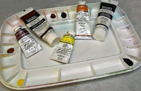
This is not fabric dye. I use artist quality heavy body acrylic tube paint. I have also used acrylic inks on more expressive or abstract cushion covers where I want more intense but still fluid colour. I have even used puff paint on a couple of cushions.
My brushes are a variety of short-handled synthetic bristle brushes. Brushes seem to wear more quickly painting on fabric than they do on paper so I keep a good supply on hand. Plain water and fabric medium are the other basics for fabric painting. I use a squirt bottle of water to keep paint on the palettes wet. I also have a few scraps of fabric at the ready for testing colour mixtures.


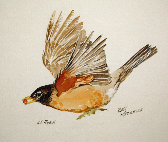
Since I paint on fabric a lot, I use two palettes. One is reserved just for unmixed tube paint and the other used to create mixtures of paint, medium & water. My palettes have tight-fitting lids. Kept wet, unmixed tube paint will remain viable for up to a week. The mixtures palette, I clean after each painting session. In the photo of mixtures you will see the individual wells with graduations of colour I prepare in advance. In this case for the robin’s wing I premixed five shades of greyish-browns as well as several reddish body colours. You may notice the white dots of unmixed fabric medium in one of the red colour wells.
Fabric medium fulfills two purposes. It controls the flow or bleeding of paint into the fabric. This gives you greater edge control. The higher the proportion of fabric medium in a paint colour, the more viscous it becomes. Especially important for me, fabric medium is a binding agent so that even extremely light washes will be permanent. Any medium dilutes colour so it will become more transparent. Where I want strong, opaque colour I use little or no medium and just enough water for the paint to become fully fluid. I want the paint to be absorbed by the fibre rather than forming a paint layer or film on the surface of the material. The only way to learn what proportion of paint, medium and water work best for you is to play with it.

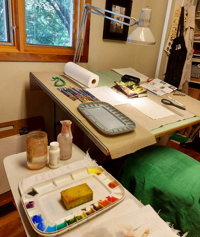
The studio setup for fabric painting shows the two palettes and the felt pad on my drafting table. Note the wet sponge I keep in the palette reserved for unmixed tube paint. There is the usual assortment of brushes, studio tools and supplies which I use regularly in fabric work.
Painting and finishing
My painting style is similar to watercolour on paper. I build layers of washes, some wet-in-wet, generally working from pale to build more intense colour. I am very conscious of the ratio of water to paint. I add just enough fabric medium to control flow as I need it and to act as a binding agent in pale washes. Generally I will mix several intensities or variations of colour before I begin painting so I have some options at the ready.


Take a deep breath and paint. Draw sparingly. You cannot successfully erase without roughing the surface of the fabric. Even though most of my work is akin to botanical or zoological illustration and needs to be precise, I draw as little as possible. Sometimes I will simply use pencil dots as general indicators. I suppose a person could use tailor’s chalk which should wash out of the fabric but I haven’t tried.
Allow the work to dry thoroughly. I use masking tape and put it on the wall in my studio. Although the acrylic paint is permanent once dry, I heat set my work with an ordinary household iron using high heat and steam.


